Magazine Design 2019-2020
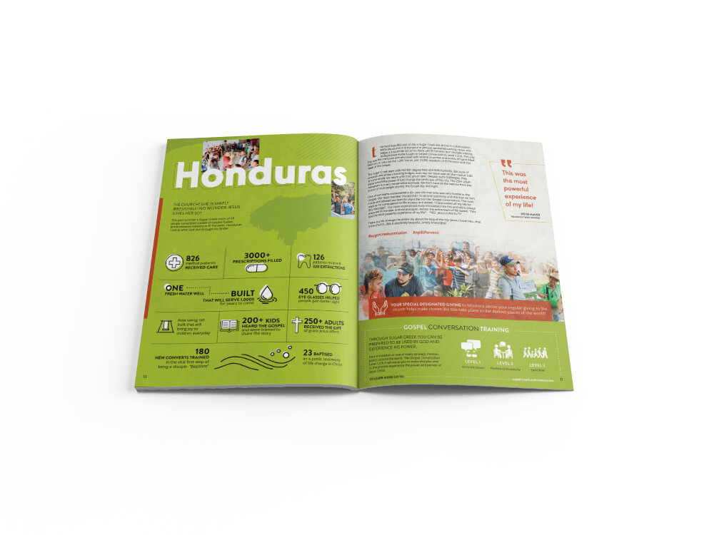
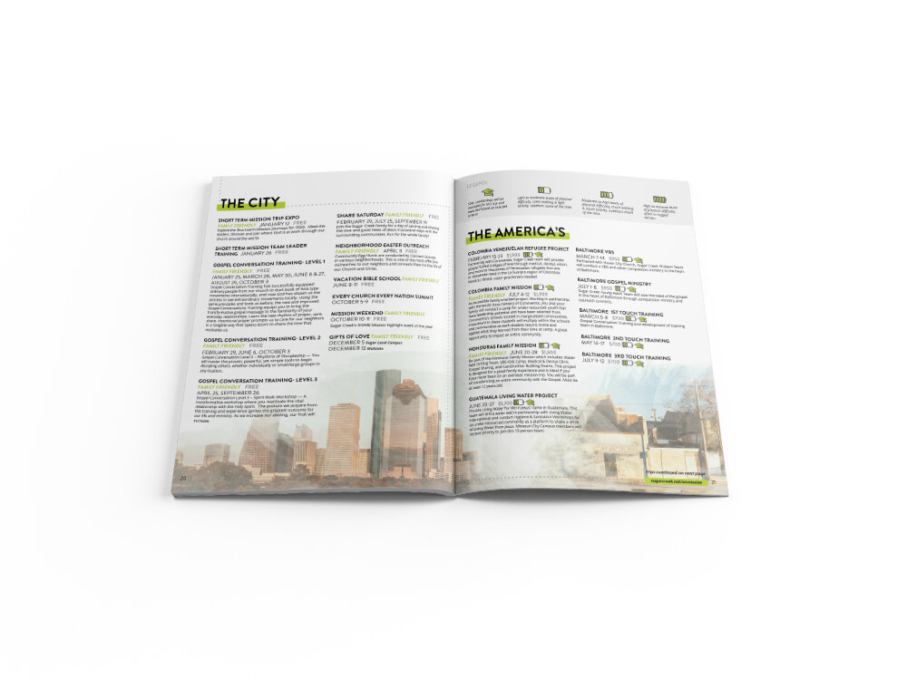
For the past few years I’ve had the honor of designing and branding the annual missions magazine for Sugar Creek Baptist Church.
This magazine is an overview of what the church has done throughout the past year and it also defines the vision for the upcoming year.
During the weeks leading up to the mission banquet (the celebration dinner where the church shares it’s accomplishments) I work tirelessly to design a piece that helps set the tone for the entire event.
I start my design process with research. A lot of research. What are the key words and bible verses for this year? Where did our volunteers travel to? How many people did we connect with? What colors and design elements will help tell that story? This year’s theme was particularly complicated because the natural tone of the question “Is Jesus Worth It?” could be taken as a negative. The objective of this year’s theme was to help shed a light on some of the difficulties that some Christians face today. Yet, despite those challenges the outcome of sharing the gospel is still worth the hardships. My job was to take that tension and visually tell those stories with a tone of celebration.
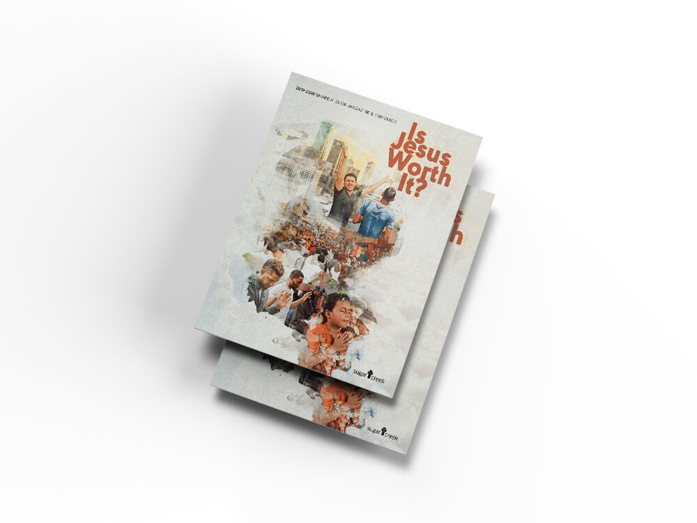
The first (and hardest) part to design is the cover. It is the catalyst for the entire piece. The process for this cover will have to be a later post, however what I will say about the cover process is that I typically come up with 3-5 different concepts and present them to the leadership team to decide which concept to go with.
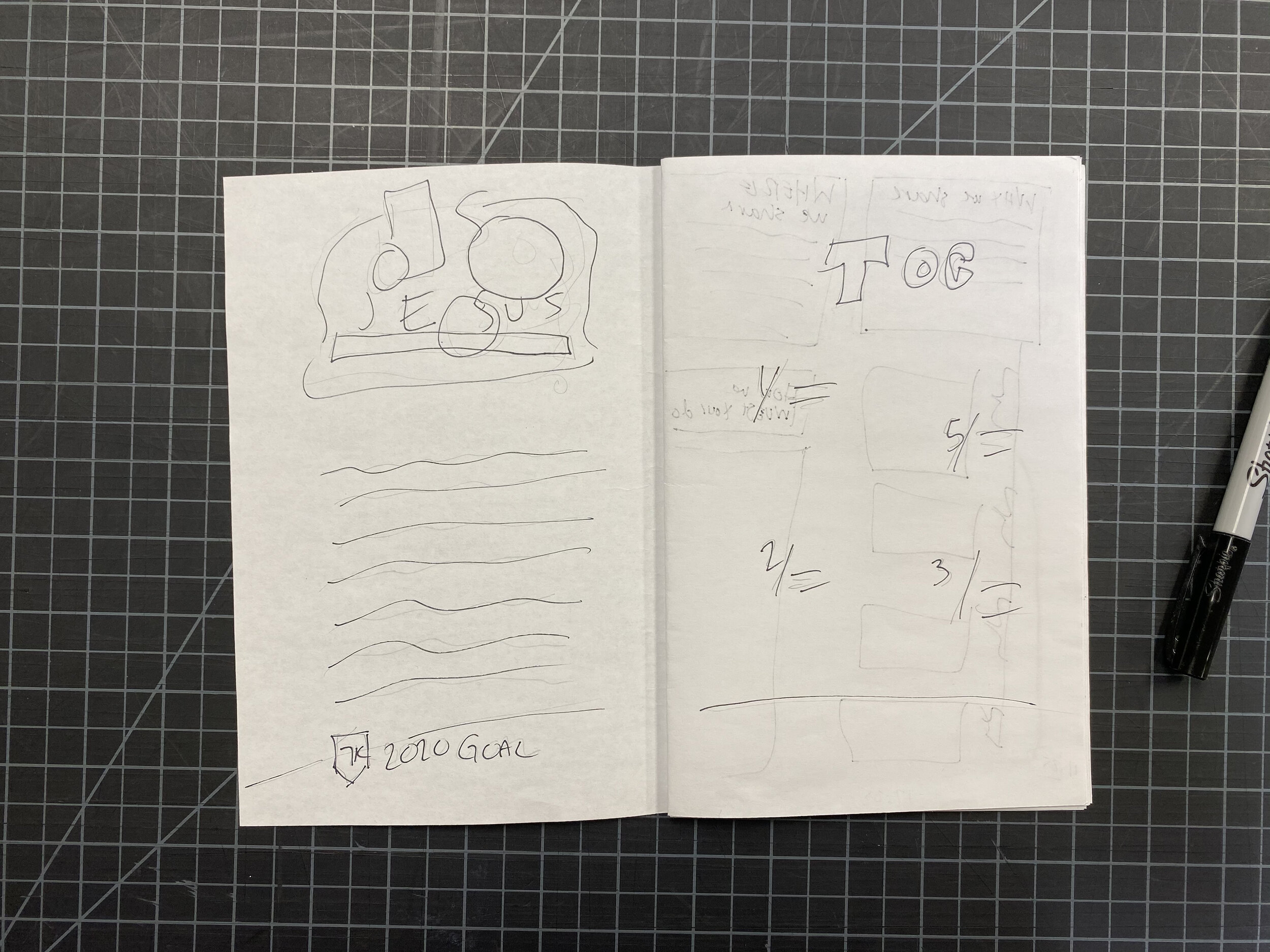
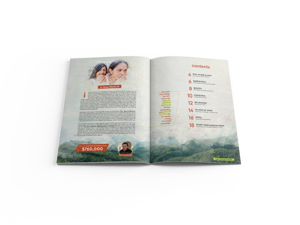
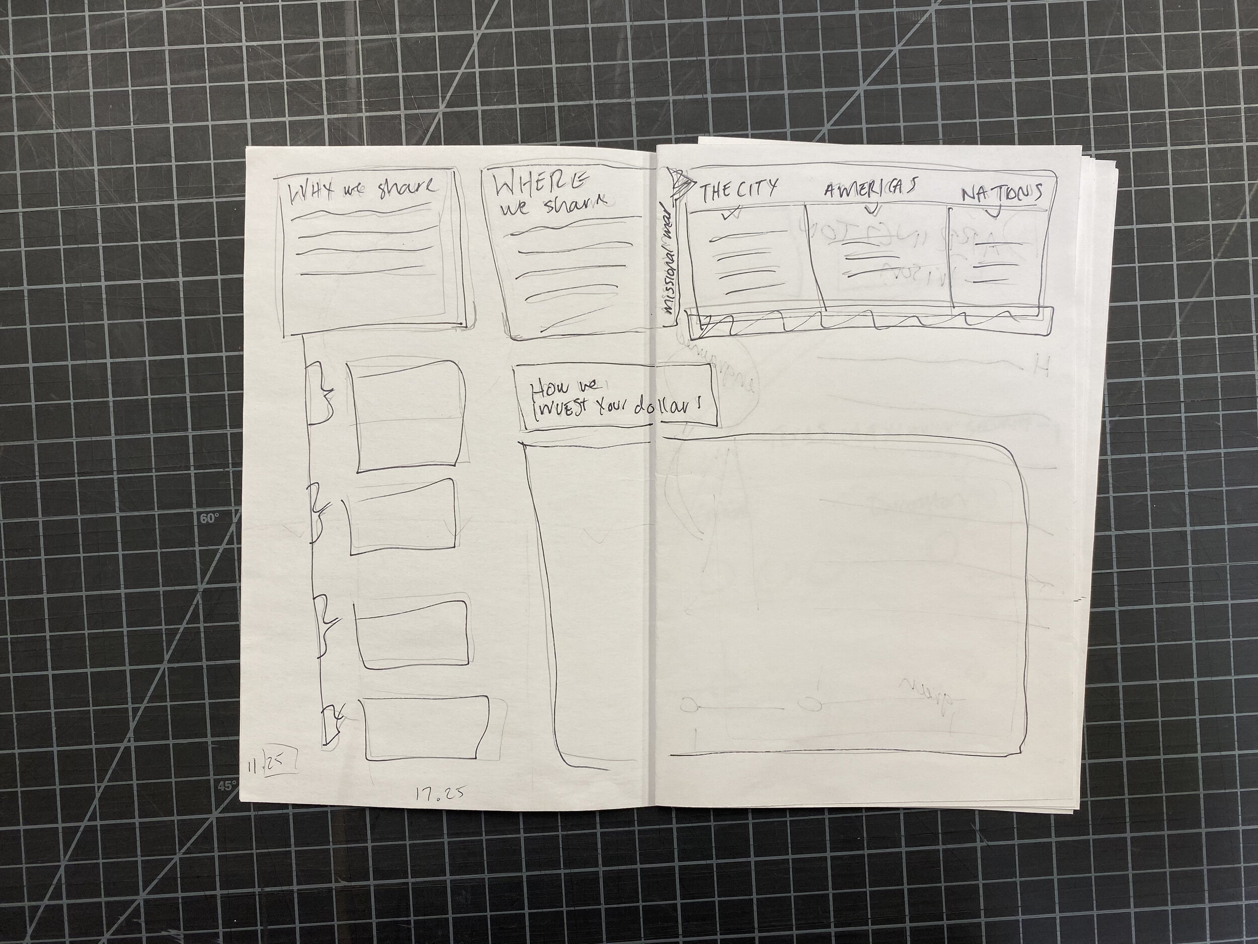
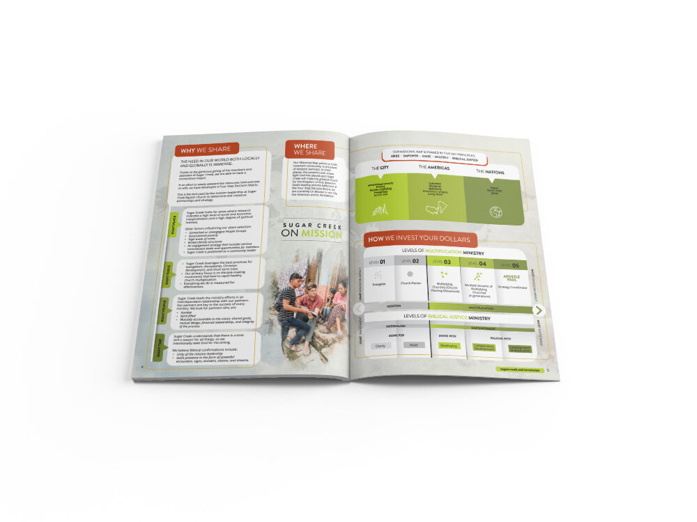
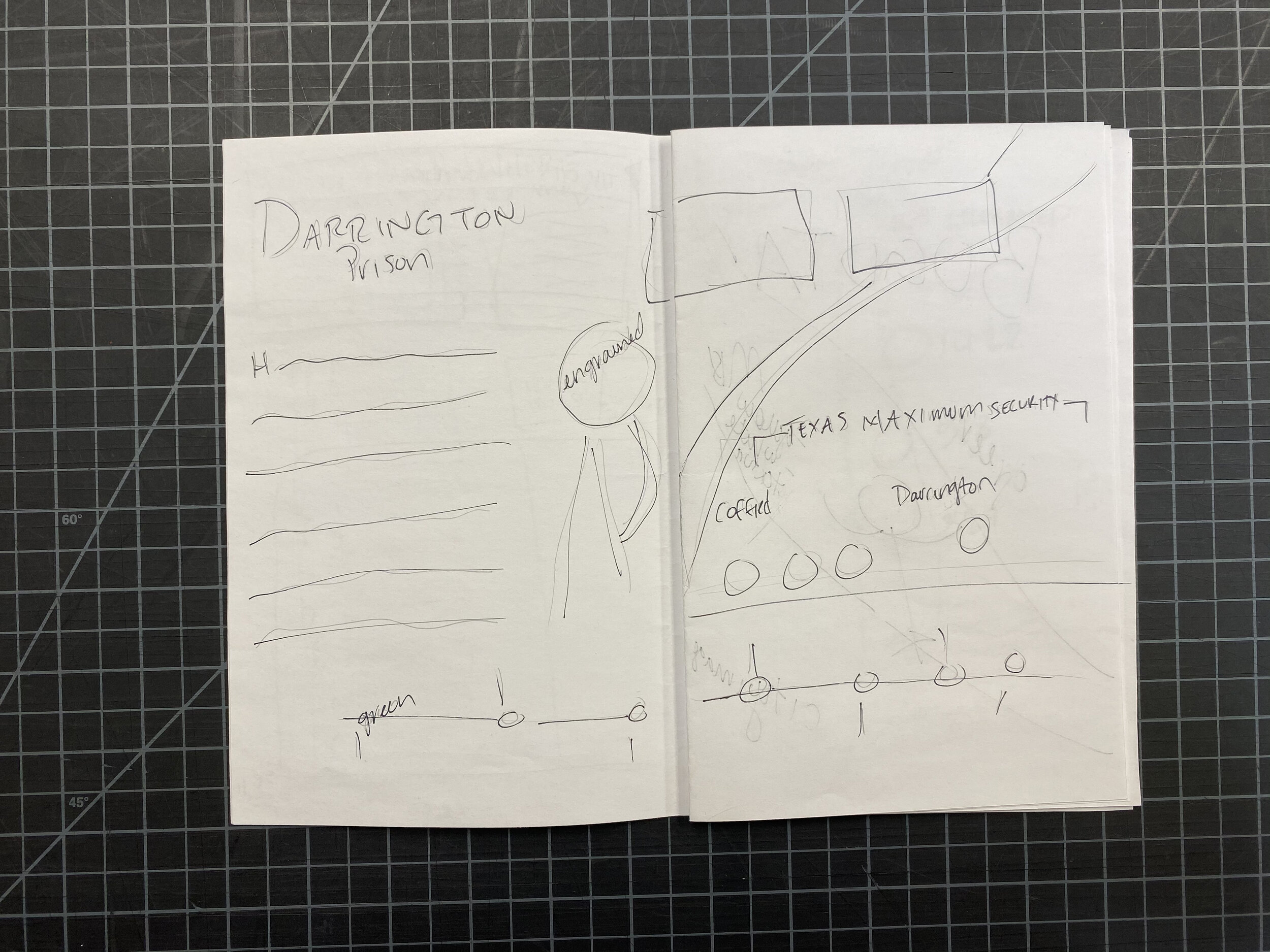
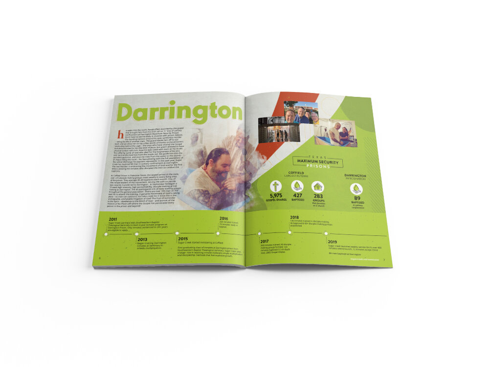
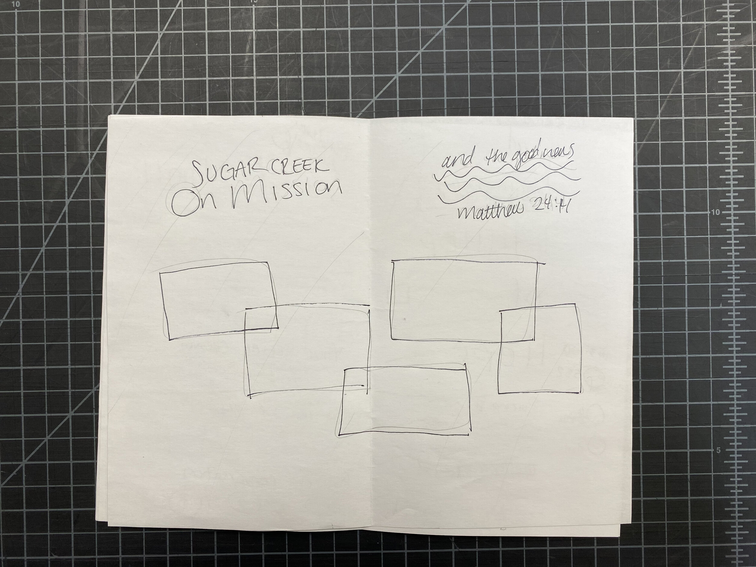
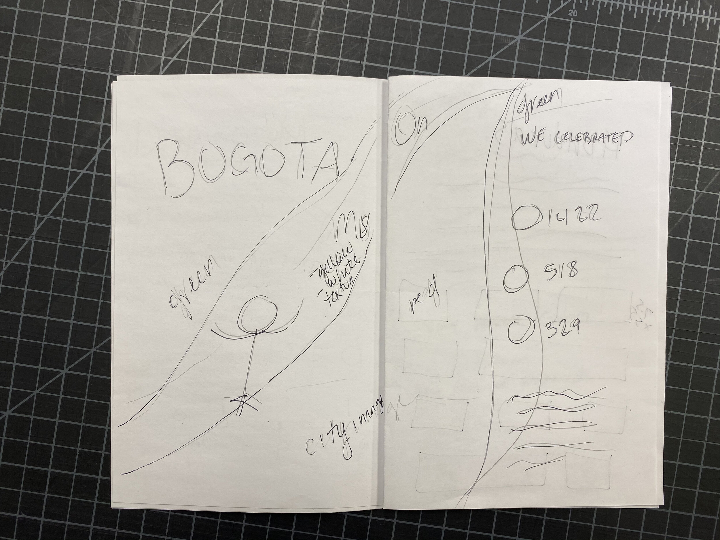
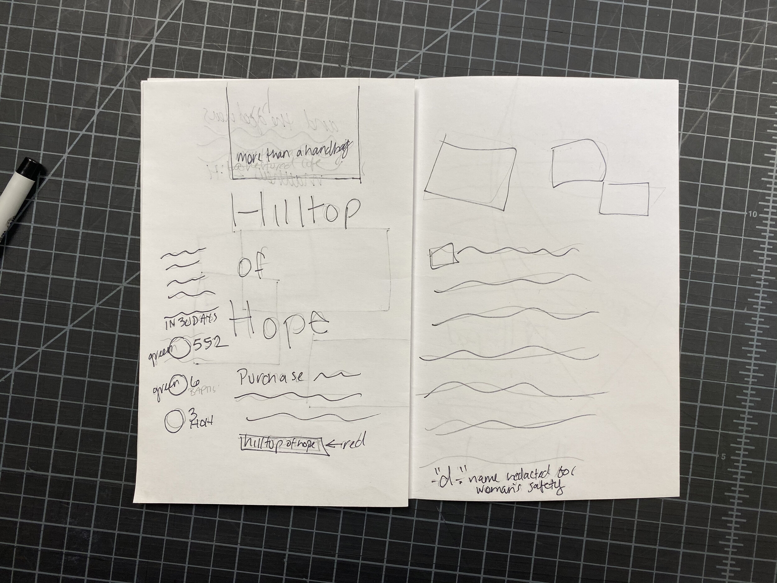
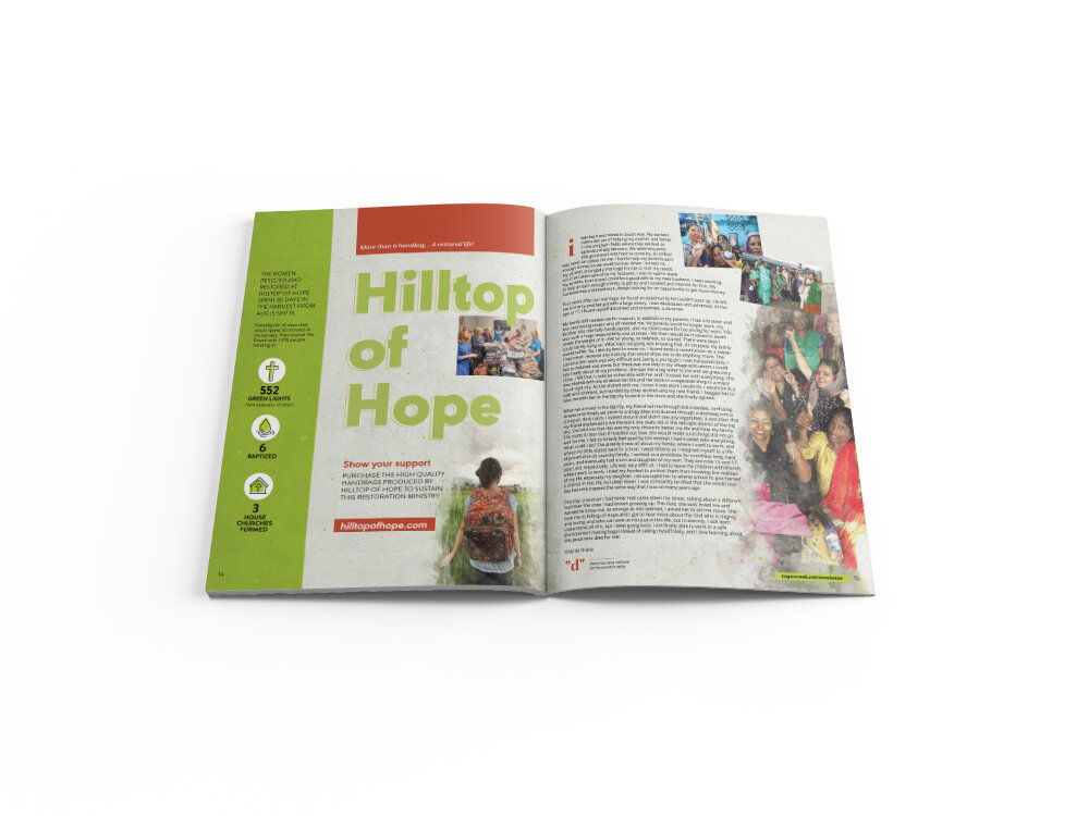
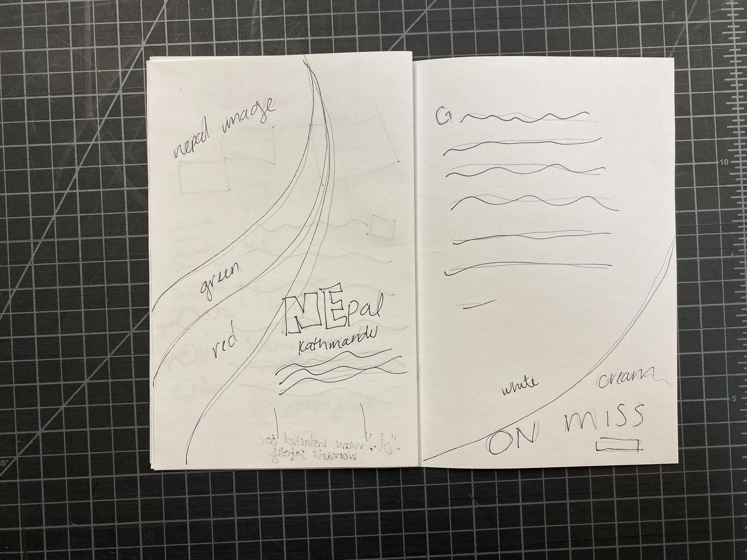
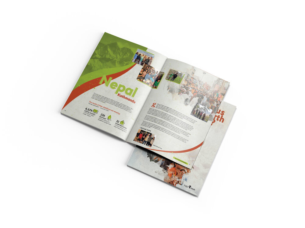
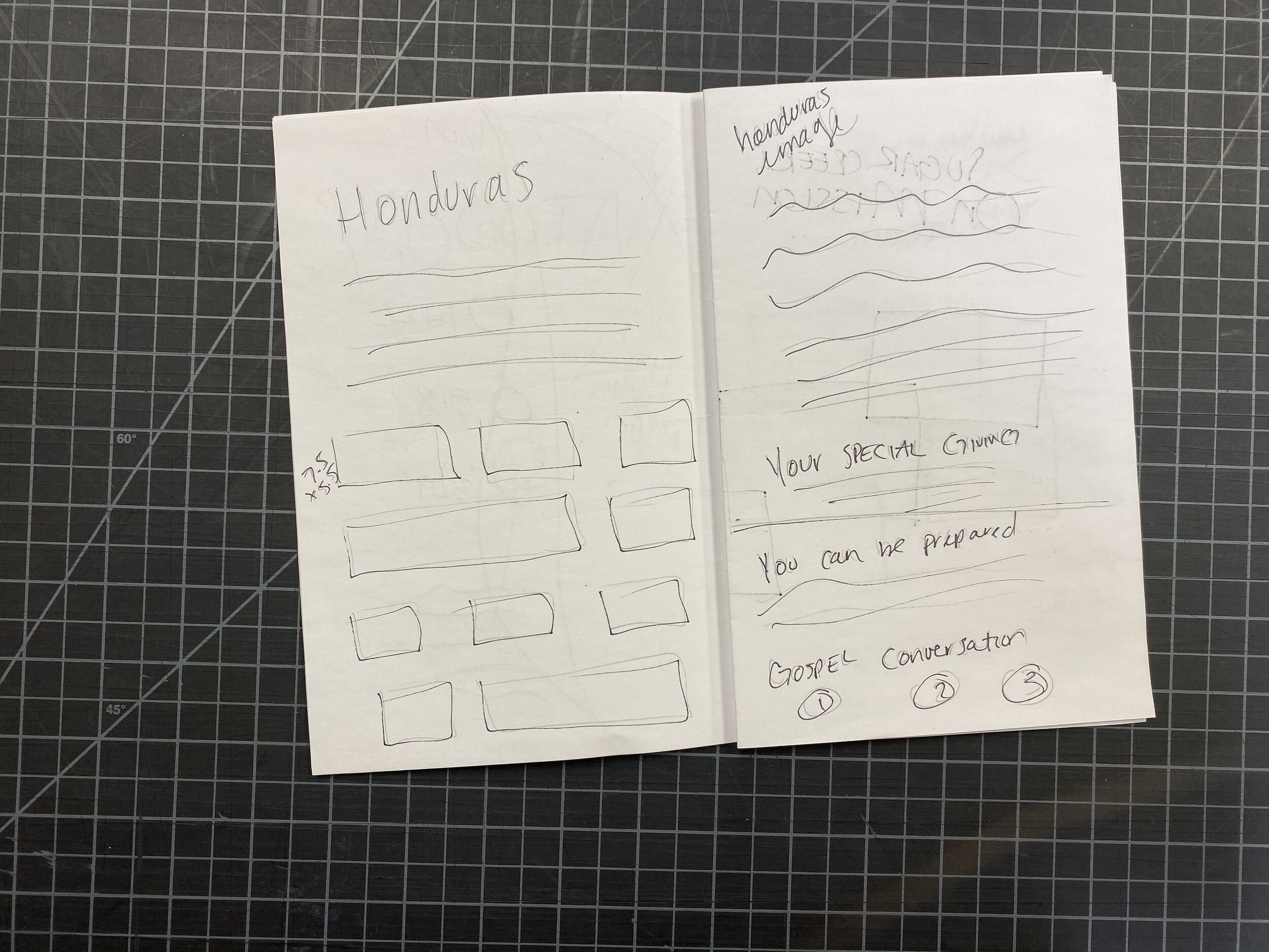
As far as the magazine design once my research and color combinations are done, I go through all of the copy- stories, statistics, narratives- and begin the layout process. Having all of the copy at hand and ready is key for this part of the process. An extra paragraph has the potential to change the entire spread. I then sketch out my designs, spread by spread. Not a fully detailed sketch, just a quick line sketch to help remind me of my ideas. I use a combination of Photoshop and Illustrator for any of my graphics and then bring everything together in Indesign along with all of the copy.
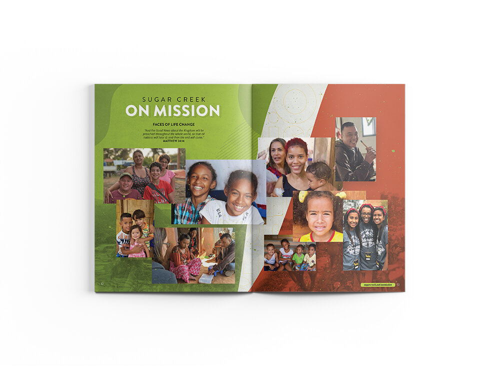
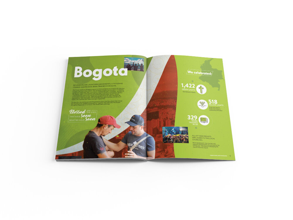
This piece is one of my design highlights of the year. It’s one of the most challenging and creative projects I have to look forward to. This year’s is by far my favorite. Scroll through the images below to see how my sketches compare to the final design and feel free to let me know how your design process compares.
Enjoy!


